- To facilitate our ad network advertising, we have to provide the content for three digital display ads (banners). You will be required to write the content for a “four frame” banner in multiple sizes. You will be required to develop a visual storyboard for each banner. Please separate each banner on its own page with the following: (15 marks)
Display Ad Sizes
| 1. 300 X 600 | 2. 160 X 600 | 3. 468 X 60 |
Please include:
- Banner size.
- Content presented in separate frames.
- 300 x 600

- 160 x 600

- 468 x 60

c) The goal of the banner.
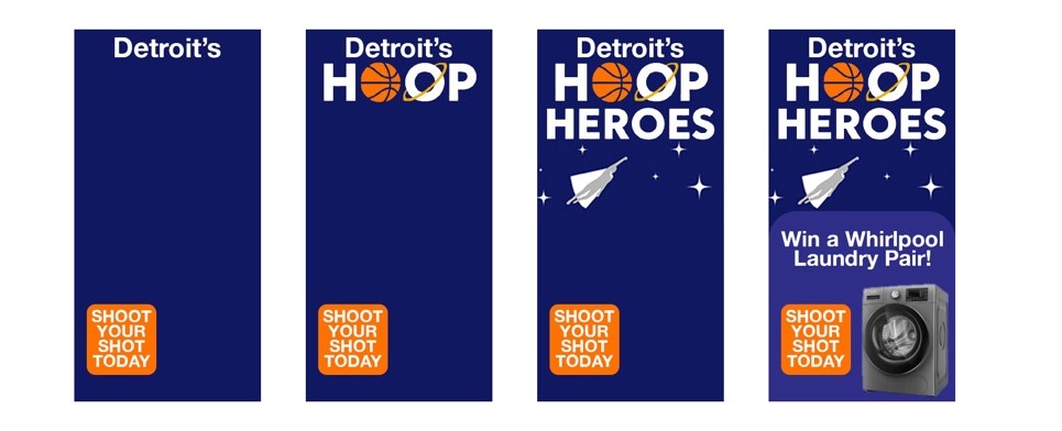
300 x 600 – Half Page Banner: The goal of this half page banner Is to capture attention and engage the viewer emotionally. This banner ad presents Hoop Heroes youth basketball charity tournament as a meaningful, community first initiative that will make the difference in the lives of the Detroit community. This banner is made to build interest and trust right off the bat. “Detroit” as the first frame, with the call to action “SHOOT YOUR SHOT TODAY” puts emphasis that this is a Detroit first initiative. The “Win a whirlpool laundry pair” also puts emphasis that there is something in it for these players. It’s something meaningful that will make a difference in their lives. Clean clothes, the luxury of doing laundry at home is a tangible prize that will make a difference in the lives of these Detroit families. This banner tells a mini story leading the viewer from top to the bottom towards the CTA “SHOOT YOUR SHOT TODAY.” The visual of the whirlpool accessory gives an immediate presentation of the prize in it for these families. This banner ad is meant to be used in placements where the viewer can take a second to sit, watch and engage with the content.
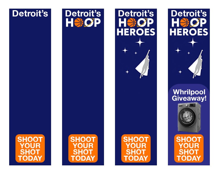
160 x 600 – Wide Skyscraper: The goal of this banner is to reinforce brand messaging and prompt action from users. This is a banner ad that is designed for a side panel placement, which means that its supposed to capture attention naturally when readers are browsing content. This layout is minimal, bold and slim. This time the text-based content is “Whirlpool giveaway” while still reinforcing the same idea and the same CTA. The goal is to be short and simple giving users a visual reminder to what Hoop Heroes is and what the youth charity tournament consists of. This banner ad helps increase familiarity and recall. Its bright, fun and colorful details and imagery will help encourage users to act.
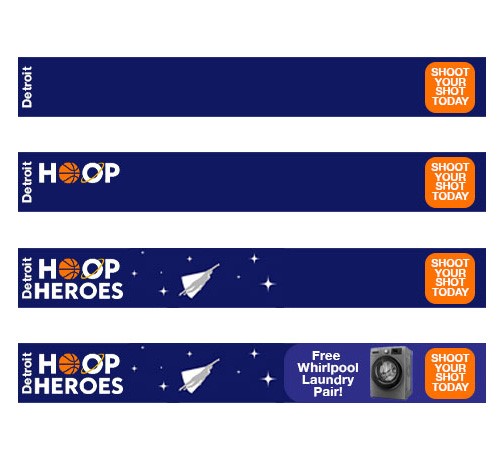
468 x 60 – Full Banner: The goal of this full banner is to deliver a message at first glance. This banner is all about ensuring maximum exposure in the minimal but enhancing space. This design guides the user horizontally from Detroit to the “SHOOT YOUR SHOT TODAY” CTA. This follows a natural reading pattern from left to right. Again, it’s not a long story, it’s a triggering quick snapshot to provide engagement. The Whirlpool washer is in the final frame giving a final motivational aspect to this banner ad highlighting the direct benefit these families could receive from this charity tournament. This full banner ad is built for speed so that users can receive a clear and direct benefit.
d) Reasoning and justification for each banner as it relates to topics covered in class.
300 x 600 – Half Page Banner: The 300 x 600 half page banner ad starts with only the word “Detroit’s” and the CTA button “Shoot Your Shot Today”. The beginning of the ad having just the word “Detroit’s” immediately captures the attention of local audiences from Detroit and builds intrigue for what’s to come next. The “white space” between the word “Detroit’s” and the CTA button makes the first frames content more digestible, as we discussed in class (Briscoe, W13 – D – Create the Perfect Animated Banner Ad (W25), slide 31). In the second frame, the word “HOOP” is revealed, which has a basketball as one of the O’s. This gives the viewer a little more information and establishes the theme of the banner ad, which revolves around basketball. The third frame is when the viewer gets the full Logo / name of the organization “Hoop Heroes” with a floating superhero. This transition adds motion and energy to the banner ad, while not being too distracting or having too much going on, which follows the rule to keep animation simple but attention grabbing (Briscoe, W13 – E – What Makes a Good Banner Ad (W25), slide 4). The final frame introduces the Whirlpool washer and dryer set, which creates urgency and adds a tangible incentive, which supports the idea that a compelling offer increases click through rate potential.
160 x 600 – Wide Skyscraper: The 160 x 600 wide skyscraper banner ad follows the same structure as the half page banner but is adapted to fit vertically on the screen. The format of this banner is narrower, meaning that the alignment had to be centered for the entire banner in order for all of the items to fit. With the narrow format, we followed a top to bottom animation style, clearly bringing the viewer down the banner with a clear path to the destination button (the signup landing page). The CTA remains visible in all frames and the design respects the rule of keeping things visually simple and relevant.
468 x 60 – Full Banner: This banner makes the most of the horizonal layout by timing the animation and information flow from left to right. First, Detroit and the CTA appear and gives the viewers an idea of what the banner is about. Then HOOP, then in the third frame, “HOOP HEROES” appears with the campaign’s mascot, the superhero. This motion is in the direction that users read online, which helps with the natural flow and smooth animation of the banner. The use of the word “free” comes up in the fourth and final frame in the sentence “free whirlpool laundry pair”, which is a trigger in digital advertising (Briscoe, W13 – A – Writing for banners, rich text (W25), slide 51). The banner isn’t too noisy and the CTA button stays in the same corner, which helps with user action.
e) In-depth explanation of your planning process and reasoning. Destination plan.
Our planning process had one simple goal: bring users to the landing page and drive sign up’s for the Hoop Heroes Youth Charity Basketball Tournament.
300 x 600 – Half Page Banner: When planning this banner campaign, the first goal was to establish some sort of message clarity that users can walk away with. They should see the banner, absorb it and retain it. This half page banner was all about storytelling in a vertical space. We knew the content should be structured to guide the user from top to bottom starting with something they know “Detroit.” Since this audience values authenticity and emotional connections, the community impact theme was very important to highlight. We also knew that this banner ad had to be reward driven, making users interested in what “Hoop Heroes” and the “Whirlpool” collaboration is. This banner ad would mostly be utilized for website designs on the homepage sidebar or feature section for maximum visibility.
160 x 600 – Wide Skyscraper for the Wide Skyscraper the banner was designed with a side panel placement in mind since it can fit perfectly for people to see. We kept the design minimal ensuring that it could stand out in narrow spaces because we don’t want to overwhelm users. By adding brand consistency with Detroit, Hoop Heroes, orange CTA while adding a clear tangible benefits these families could receive, we are taking advantage of a quick visual appeal perfect for exposure to the campaign.
468 x 60 – Full Banner: This full banner ad is all about delivering the message at a quick glance. This banner is in a Z-pattern, meaning that it goes from left to right, starting with the word “Detroit” and ending with the CTA. The process was all about guiding users to the end benefit, the Whirlpool product. This is visually placed at the end because it’s a motivator to a direct and tangible benefit, making it the lasting impression of this banner ad. We made this banner so it could easily be placed on the top or the bottom of a page so that users can still get a glance about the initiative.
The destination plan is to link directly to the Hoop Heroes dedicated landing page. This landing page is the dedicated sign-up form for users to visit and enter to play in te youth charity basketball tournament. The idea behind the banner is to stay consistent and ensuring a seamless user experience. This ensures that users don’t feel confused, or disconnected with where they should go next. This will help improve sign up conversions and bring energy and interest to the banner ads.
Leave a Reply