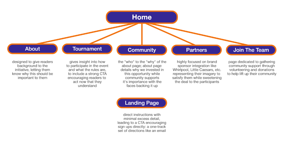
1. Website
As mentioned above, you are tasked with creating a general website to focus on organic website visitors. You will be responsible for the website content structure including the content. The site will be a minimum of five (5) pages not including the home page. You will not be required to create a “working and live” website, rather a mockup website in a paper format. Here is what you will need to provide:
- A sitemap illustrating the various site pages.
- A complete page for each page of the website inclusive of the website content.
- A homepage mockup including the main site navigation.
Tasks:
1.Provide a general overview of the website including the page titles as well as a brief overview & intent for each page. Based on your research and knowledge covered in ADV 421 (as well as included in this project), provide in depth reasoning as to why you structured the site in this manner and why you intend to create the specific content. (10 marks)
Index
Overview:
The index page is created to make an emotional connection first to hook the readers, then deliver context as you scroll. It starts with a bold headline that feels aspirational, inviting youth and families to see something bigger than just a tournament in the event- while supplying sponsored imagery to appeal to other audiences who may be interested in supporting the cause rather than playing. instead of explaining everything at once, the homepage gives a more focused preview of the campaign by highlighting key figures, sponsors, and benefits in digestible sections; it’s goal is not to answer every question, but to draw the visitor in just far enough to explore. Every section is deliberately brief but impactful which creates a balance between emotional appeal and clarity- easy navigation and attention grabbing one liners help to make this an easy read while the visual appearance keeps it simple and playful enough for the whole family, especially since this is the first and only page that casual visitors will see. The structure is less about information and more about interest, it invites people into the rest of the experience without requiring them to commit upfront.
About
Overview:
The About page exists to slow the momentum down just enough to introduce the people and values that make the campaign feel real, which means it doesn’t just deliver background information or serve as a formality, but instead works as an anchor that grounds the entire initiative in something that feels personal, honest, and built with care. It reinforces the idea that this is not a one-off tournament or promotional event, but rather a collective of people who believe in the potential of youth and the value of meaningful support. The structure of the page prioritizes readability while still offering enough space for emotional storytelling to take shape, which means including direct mission points as well as natural language that feels like it could be spoken aloud. This is important not just for tone consistency, but for ensuring that visitors who arrive here looking for clarity will find something that answers more than just what this campaign is- it helps them understand why it exists, who it’s for, and how it connects back to real people with real experiences.
Tournament
Overview:
The Tournament page acts as the core informational space within the site, but instead of diving straight into logistics, it opens with emotionally-driven language to maintain the same inviting tone established on the homepage. This decision is based on the understanding that people don’t engage with opportunities just because they’re told the when and where- instead, they need to feel like they belong in the space before they care about the details. The content then transitions into a clearly structured breakdown of how the tournament works, making it easy to scan while still giving the sense that this is a high-quality, organized event that takes pride in the experience it delivers. The inclusion of both emotional hooks and technical clarity is important for making the content accessible to both youth participants and the adults supporting them, whether they’re parents, coaches, or school partners. The goal is to give people the confidence that this is something worth committing to while still keeping the tone casual enough to feel welcoming from the first read.
Impact
Overview:
The Community Impact page was created to show that this campaign is not just designed for communities, but is actively built by them- by families, schools, volunteers, and businesses that are already playing a role. Instead of presenting support in abstract terms, the page highlights specific actions that have already been taken by different groups in order to emphasize that the foundation for this event has been set, and the reader is simply being invited to add to something that is already working. Structurally, it balances direct information with social proof, including a testimonial that adds emotional weight without feeling overly rehearsed. The use of short sublists makes the roles clear and manageable, which is important for making people feel like contributing is possible even if they’ve never been involved in something like this before. This page is just as much about inclusion as it is about promotion- it shows people that they don’t have to be experts or insiders to make a difference, just willing participants in something bigger than themselves.
Partners
Overview:
The Partners page offers something more than a thank-you list- it functions as a strategic positioning tool that highlights how brands can integrate with the mission in a way that feels intentional, visible, and aligned with real outcomes. The decision to structure this page around contributions rather than titles or sponsorship tiers was a deliberate one, because it reframes the companies involved as active supporters of community betterment rather than simply names on a banner. Each section focuses on what these sponsors have made possible and why that matters to the families and players on the ground. That level of transparency and specificity increases trust not only with the audience, but with potential future partners who may be looking to get involved in a campaign that demonstrates proof of impact rather than empty gestures. While the tone remains professional and respectful, it still fits within the larger voice of the site- it’s community-focused first, corporate second, and that hierarchy is reflected in both the copy and its layout.
Join The Team
Overview:
Join the Team is structured as an open door rather than a formal sign-up, which is essential when asking people to give their time, energy, or attention. This page uses conversational language and clearly outlined expectations to make the volunteer process feel less intimidating and more like a natural next step for someone who already believes in what Hoop Heroes is doing. The roles are described in a way that makes them feel purposeful rather than transactional, and the testimonial included adds emotional credibility to the request. The goal here is not just to get people to help, but to help them see that doing so will mean something. That’s why the structure avoids large blocks of instruction or overly complex forms- instead, it builds on the existing sense of community and invites people to step into a role that’s already been prepared for them. The tone remains consistent with the rest of the site, which helps reduce any drop-off from visitors who are deciding whether to move from interest to action.